The past week I have been making more work on my contents. I was able to produce an effective layout that will be readable but also visually exciting - however I am lacking a lot of the text and imagery. When I first produced the contents page text I wasn't certain on my layout or how it would look as it hadn't been finished so I have had to recreate it.
I consider my contents page to be nearly finished. I looked up magazines for effective layouts and I took a lot of inspiration from an NME cover as I deemed it to be an effective layout which mirrored the tone I wished to create. I am yet to recieve feedback (aside from my Mum saying cheerfully "Oh that looks nice!") so I am anticipating making improvements but I feel that I have done as much as I can to make it look effective and I am able to focus my attention on the other pages that need completing.
This week I hope to take some more photos of other musicians for use on my contents page so I can finish that off before the Final Draft deadline on the 16th!
Tuesday, 3 December 2013
Equipment
In the production of my music magazine I have been utilising
different kinds of equipment to achieve a professional look. This blog post
will be looking at some of them.
To take the actual photos I had to book a photo-shoot in my school where the media department provided the backdrops, cameras and lightings.
The backdrops were three different rolls of paper of different colours – white, black and green. The one I used most was the white roll as it presented clear, crisp professional photos with attention drawn to my model. Near the end I chose to use the black roll as I thought it would look great with the style of my model who was wearing black and white. The end results were very professional and visually exciting photos. Unfortunately there were many inconveniences when using these rolls as the chain used to roll them down broke on a couple occasions forcing the model and I to put our photo-shoot on hold while we sorted out the chain.
Luckily, the camera we used was a lot more reliable. It was a High-Tec Canon SLR which produced great quality photos inside and out of the studio. We used artificial lighting to create the most effective images in the studio which flashed when I took the photo. The quality of the photos was essential for creating an effective music magazine and I think I achieved this.
For the production of the magazine we opted to use InDesign as opposed to Photoshop which we used when creating a magazine last year. I have so far found InDesign to be much more effective – especially as it seems designed for developing magazines – and I have made great use of the column feature which is especially evident in my contents page. However I am still using Photoshop for work on individual images such as removing the background for photos and altering the colours. I have needed to familiarise myself with Photoshop as it has been a while since I used it.
Sunday, 1 December 2013
Tuesday, 26 November 2013
Article Box Out Text
The One to Watch –
2012
Before we printed, we
were a blog. Here is an extract from an article from a year ago where we (quite
rightly) pointed to Nick Decruz as an artist to watch before he took over the
world.By this point you’ve heard Imagine Dragon’s hit song Radioactive. Background song to many a video game trailer and almost always played on the radio. It’s a fantastic song but people are already beginning to feel it’s overplayed.
How refreshing this Acoustic Cover is then.
(On the blog we had a
link to the video. Scan this page with the POLARIS MAG APP for a link - Edd)Nick DeCruz from North West London picked up a guitar and played one of his favourite songs. While the techno sounds that have become synonymous with Imagine Dragons are lacking, their presence isn’t missed due to the powerful guitar’s melody and powerful vocals.
Nick’s suggested the option of recording more songs,
something we’d love to hear.
Give it a year and he’ll start writing his own songs.Monday, 25 November 2013
Drafting update 25/11/13


Here you can see my music magazine well underway. I have outlined the contents page and have begun inserting the text. The bottom picture is my full bleed image - a high quality photo I took taking up two pages as an introduction to my magazine.
Saturday, 23 November 2013
Promotional Methods
When it comes to launching a new magazine, the early promotion could be what determins whether it sinks or swims. This is why I've developed a variation of promotional methods in order to spread the awareness of my magazine.
Polaris oriinally existed as an online blog which gained enough attention to justify print publishing. While the existing online readership wouldn't be enough to carry to selling of the magazine, these readers will serve to promote the magazine efficiently.
Polaris will create accounts on many prominent social media and networking sites, including Facebook, Twitter, Soundcloud nd Tumblr. All of these (aside from Youtube) provide a newsfeed where users can follow other users and share their posts. Those who share/reblog/retweet Some of Polaris' posts/tweets will be promised a follow (where possible) and a feature in the digital magazine which could include a shoutout to their twitter or an embedded video they've produced. The nature of a professional music magazine offering readers the chance to be featured as musicians will become very popular and I feel it is guaranteed to become viral amongst the music making comunity very quickly.
Here will include a feature of Polaris' Twitter account.
I also feel that Polaris is responsible for the rise of many artists due to its days on the blog. These artists will likely be persuaded to film a brief advertisment to be shown on related videos on Youtube.
Here's a transcript I've written which would star the cover star of Polaris' first issue which would be delievered in a very cheeky but humble way. Clicking on the video would send the viewer to the website.
Nick DeCruz
Hey, I'm Nick DeCruz. Yeah, that one. You may know me from... everywhere. I'm kinda a big deal right now. But, I wouldn't be where I am now if it wasn't for Polaris. These guys shared my video with thousands of readers, stuff happened and.. Well, Hello. Look out for the first print issue of Polaris in your newsagents the first week of November and get involved online.
(Video shows website address, Twitter handle, "Like us on Facebook" and "Follow us on Tumblr")
Polaris, finding tomorrow today.
(Nick gives a big grin as the video ends)
Tuesday, 19 November 2013
Article Text
It’s not every day
when you get to interview one of the greatest breakthrough acts in recent years
– Unless of course you work for a music magazine. We’ve opted to pass the reins
to one of you (details on the contents page) to speak to the uprising
revolution that is Nicholas DECRUZ.
The first time my path crosses with DeCruz is in Brighton.
He had arranged a meet up on the beach through Twitter, and I, like many of his
followers took this opportunity to meet him. This was when I realised what
appeal he had. People of different genders with an age range from eleven (with
their parents nearby) to early twenties had turned up, some bringing their own
instruments.
This was never going to be a prophet and his disciples,
before long DeCruz was playing instruments with everyone there – he and I did a
wonderful rendition of The Rolling Stones’ Street Fighting Man with him
managing to find an accompanying harmonica melody while I played his guitar.
It’s a Testament, then, that seven months later, soon after
his album’s release on ITunes and subsequent rise in the charts (almost unheard
of from someone who’s previous primary output a year ago were just acoustic
covers of Imagine Dragons) that the first thing he asks after I enter the
coffee shop we arranged to meet – ten minutes late – was if I was “The Rolling
Stones guy from Brighton”.
“Why wouldn’t I remember people from that day?” He says. “It
was fantastic being with everyone on that beach. I remember loads of people.”
Nick smiles, remembering. “I had never done anything like that before. I was
worried no one was going to turn up.” Unlikely to happen now, since his sudden
rise in fame. Nick nods in bewildered agreement, as if he isn’t quite able to
believe it himself.
“All I did was start posting videos on YouTube. I had a
guitar, I was practising with it and when I heard songs I liked I played them
myself and put them on YouTube. I just
wanted to see if anyone would listen.”
And they did. So what caused the jump from covers to writing
your own songs? I asked him.
“I had never found it easy to write songs,” Nick admits. “I
just felt I was trying to force them to be something they weren’t. Then… I
didn’t. I just decided to write, play and sing and I never looked back. I just
devised them naturally. From the…” He stops himself with a grin before he
unleashes a cliché.
“Sorry, I’m pretty new to this interview thing.” I remind
him that I am too. I have to steer the conversation back to him as he attempts
to ask me how I got to write this interview, reminding who people want to read
about.
“That is unbelievable too.” He adds. “It’s gone from
listening to my music to wanting to know things about me! I’ve never been in
that position before.”
On his first album release, The Light at The End, Nick has
this to say: “Well, some friends bought me a session in a recording studio for
my birthday. They all pitched in together and it was one of the best things I’d
ever got. This was when I started writing songs so I spent the rest of the
holidays working on producing the best songs possible that I could record. It
was intense, but great fun. With the digital copies it was just the matter of
pressing a few buttons to release some of my songs as free podcasts before the
reception offered me the possibility of selling an album.
In this time, it is so incredibly easy for musicians to put
out music. Unfortunately it means that the Small Fish in a Big Pond finds
himself in the middle of the Pacific Ocean, you know? And it’s just the hope
that people will fish you out and serve you with chips.”
So why did people take to the music so much? Nick pauses,
considering this.
“I already had people who would listen to my music.” He
notes, “I was releasing my covers on SoundCloud and YouTube. I suppose word of
mouth had something to do with it.” He suggests. “And, I guess it is just
proper old-fashioned music. I love Pop Music; Lady Gaga is a god amongst us,
but you don’t get as much music with people just… playing.”Contents Page Text
| Index:
40: DECRUZ
54: Splat
38: Overtones
29: Atlantis
10: Danny Brown
49: OutKast
11: Visuals
29: Zak Labiad
Arcade Fire
Daft Punk
Jake Bugg
Minor Alps
WoodKid
Neutral Milk Hotel
The Prodigy
Waves
Beck
Plumtree
Two Door Cinema Club
David Bowie
Rolling Stones
Fireworks
Old 97’s
SoundGarden
Icona Pop
Bruce Springsteen
The Mountain Goats
Azealia Banks
|
40: DECRUZ
54: Splat
38: Overtones
29: Atlantis
10: Danny Brown
49: OutKast
11: Visuals
29: Zak Labiad
Features:
Reviews 54-60
-
Arcade Fire
-
Daft Punk
-
Jake Bugg
-
Minor Alps
-
Scott Pilgrim Colour Editions
-
Pacific Rim DVD
Previews: 60-65
-
Glastonbury
-
Download
-
The Lego Movie
-
Muse album
23: How to be big on YouTube
You:
17: NewTube
21: Reader’s contributions
25: SoundCloud
27: UnSung Heroes
26: Fan Mixes
Index:
DECRUZ
Splat
Overtones
Atlantis
Danny Brown
OutKast
Visuals
Zak Labiad
Arcade Fire
Daft Punk
Jake Bugg
Minor Alps
WoodKid
Neutral Milk Hotel
The Prodigy
Waves
Beck
Plumtree
Two Door Cinema Club
David Bowie
Rolling Stones
Fireworks
Old 97’s
SoundGarden
Icona Pop
Bruce Springsteen
The Mountain Goats
Azealia Banks
Wednesday, 13 November 2013
New Media
In this day and age, any magazine which doesn't make full use of the wide variation of online media is likely to fail.
Polaris orginated as a blog, so has always been rooted in the digital world. Despite the move to a bi-weekly printed magazine, the digital aspect will develop too.
Weekly, along with the biweekly print magazine will be the Polaris Digital Experience. Here is the press release.
Polaris orginated as a blog, so has always been rooted in the digital world. Despite the move to a bi-weekly printed magazine, the digital aspect will develop too.
Weekly, along with the biweekly print magazine will be the Polaris Digital Experience. Here is the press release.
"Not enough stars in your life? Polaris is going weekly! Starting from December, prepare yourself for the Polaris Digital Experience. Each weekly magazine will be instantly updated with the latest news and information, including embedded music videos and tracks, Q+A and Liveblogs.
This is more than just another digital music magazine.
Combined with the best interviews from the artists who made it big through the new old fashioned way, tips and hints how you can do the same and a network for music fans like you, the Polaris Digital Experience offers the best resource for every aspiring musician."
The free app that will feature the PDE as a paid feature will also include a QR scanner for the print magazine, offering readers easy access to videos and songs through their smart phones. These videos will include extra interviews or previews from upcoming songs.
Polaris will create accounts on many prominent social media and networking sites, including Facebook, Twitter, Soundcloud and Tumblr. This will offer the readers another easy way to interact with the magazine, with their tweets or posts having the chance of being included with the magazine. It would also be very easy to give musicians the control of these accounts for an evening allowing them to do a Q+A with the fans in a very easy and convenient manner.
Photo of Polaris Twitter.
Monday, 11 November 2013
Production Diary: 11/11/13 - Progress

This is a draft of the cover I have been developing. As you can see, there are a few examples of placeholder texts but due to having taken my photos already I was able to select the image I wanted to use and work around that.
The image I went for was a rather plain close up, which means all the attention is drawn to his face and the text so there aren't many distractions - this is regularly done on music magazines and by doing the same I've created a professional look, meaning it wouldn't seem out of place on a newsagent's stall. I'm very proud of my front cover and I'm enjoying developing it.
The image I went for was a rather plain close up, which means all the attention is drawn to his face and the text so there aren't many distractions - this is regularly done on music magazines and by doing the same I've created a professional look, meaning it wouldn't seem out of place on a newsagent's stall. I'm very proud of my front cover and I'm enjoying developing it.
Thursday, 7 November 2013
Cover Lines
 |
| These lines will be at the top. These promise reviews and features the readers will recognise and allows the inclusion of a mysterious unknown artist with the concept that they will become big. |
 |
| A big bold button detailing a guide that many readers will apreciate. |
 |
| Standard sell lines listed by the side.Many of these are established artists who the readers will recognise and want to read about. |
Wednesday, 23 October 2013
Model Release Form
Proof that one Mr Nick DeCruz has given me permission to use his image for my magazine.


Sketches


Here are the sketches I developed before designing my magazine. I did the cover before my photoshoot as I had a good idea of the photos I wanted to take and the contents was one of the first things designed.
For my double page spread opening, I wanted to work out how I was going to incorperate one of my favourite images I had taken. This was also where I came up with the intertextual tagline "To Infinity".
I didn't sketch my other double page spreads as I created them by choosing the images and working around them.
Tuesday, 22 October 2013
Mood Board

My Mood Board is focusing on some of the interests of my intended readership, covering the sort of bands and tone they would like to see present. These bands include Two Door Cinema Club and Plumtree. Pitchfork is a website with a lot of information on Indie music and Soundcloud serves as a Twitter, but for songs.
Monday, 21 October 2013

Friday, 18 October 2013
Colour

For the second and last scheme I opted to include another shade of the colour in order to further the theme. For the brown and orange the second shade/colour generates a"grungey" run down feel that is apparent in rock magazines.
The one with the two reds just furthers the colours and offers variation within the colour scheme.
All the single colours are quite dark colours in order to fit with the Indie Music magazine genre.
While a part of me would like to use to purple colour scheme, I am aware that it may exclude the male gender due to it's connotations whereas the first red colour scheme offers no exclusion and is well linked to music magazines due to it's useage in Rolling Stone and Q to name a few.
It would be tempting to use a different colour to be different however it is worth remembering that red is an often used colour for a reason and will help establish my magazine as familiar instantly.
What's in a Name? Part Two
Here you can see my thought process for developing a name for my music magazine, using the three main types of magazine names - Acronym, Compound and Connotations.
Thursday, 17 October 2013

Wednesday, 16 October 2013
Props and Costumes
 |
| Props. |
Here is a look at some of the props I chose to use for the photoshoot.
As I wanted to portray my model as being as approachable and down to earth as possible, I decided to use some novelty Toys to achieve this. To keep it striking and visually interesting the ones I chose were individual and slightly out of the ordinary - hence the giant Lego Mini-figure and using a Gameboy Colour instead of a newer PSP.
 |
| It's normal size - I'm just playing with the persepective. |
The Guitars served as a reminder that my model is a musician and as the instruments were slightly battered, it enhanced the themes I was developing - even though they are successful, music these artists don't mind using an older instrument.

This is my model in costume. I specifically asked him to wear these things to create the look I intended. He needed to wear an outfit that would gain him respect (which was presented through the jacket and shoes) but the jeans and T-shirt relay that he is laidback. The smart/casual look was what I wanted to create.
Tuesday, 15 October 2013
Production Diary: 11/10/13 - Research and Planning
This week in media I have been primarily researching and analysing names and mastheads for use in my music magazine. I have looked at different types of names and considering what worked and what I will be able to use in my magazine.
I have begun to plan my photoshoot which will be on Wednesday and confirming models and their props. I believe for variation I need two artists, allowing me to have different features in the contents pages and generating more opertunities for articles. One will be an established, exciting artist who is likely to be my cover star, the other an independent artist who is yet to attract the attention they deserve.
I have begun to plan my photoshoot which will be on Wednesday and confirming models and their props. I believe for variation I need two artists, allowing me to have different features in the contents pages and generating more opertunities for articles. One will be an established, exciting artist who is likely to be my cover star, the other an independent artist who is yet to attract the attention they deserve.
What's In a Name? Part One
There are four distinctive types of titles for music
magazines. These are:
Acronyms are defined as words formed from initial letters of words in a set phrase and these are popular when used with music magazines. One of the most recognisable is NME, which stands for New Musical Express. It is probable that the average reader does not consider what NME stands for, just that the brand identity has made it linked with music magazines.
If I were to choose an Acronym, the
letters would need to be catchy and flow. Most letters are monosyllabic but
some are easy to say than others. Zoolike Wonderful Beats would probably be
better off picking a better name than ZWB, if only to make it easier to say.
 The Masthead for Q is an iconic, constant large letter Q in
white over a red background. This stands to function as the magazine’s logo and
features inside the magazine as well as predominantly on their website. This is
often the only constant thing on the magazine cover so it would have been
important to design it to be recognisable.
The Masthead for Q is an iconic, constant large letter Q in
white over a red background. This stands to function as the magazine’s logo and
features inside the magazine as well as predominantly on their website. This is
often the only constant thing on the magazine cover so it would have been
important to design it to be recognisable.
 NME’s
masthead opted to print what the initials stand for underneath the letters
which are in blocky, red text. This gives the readers an understanding and
context of what the magazine title means. I feel if I were to opt for an
Acronym for a name I would also do this as opposed to Q’s seemingly random
letter.
NME’s
masthead opted to print what the initials stand for underneath the letters
which are in blocky, red text. This gives the readers an understanding and
context of what the magazine title means. I feel if I were to opt for an
Acronym for a name I would also do this as opposed to Q’s seemingly random
letter.


 Interestingly, the Masthead for Top of The Pops has gone
through many significant changes in the last ten years. This may be due to the
niche and childlike target audience, not many children are likely to want to
keep reading the magazine gone eight at the eldest. However, there are some
consistencies. The bright colours make the magazine seem appealing and
friendly, reassuring the reader and buyer (likely two different people
considering the ages!) that this is child friendly.
Interestingly, the Masthead for Top of The Pops has gone
through many significant changes in the last ten years. This may be due to the
niche and childlike target audience, not many children are likely to want to
keep reading the magazine gone eight at the eldest. However, there are some
consistencies. The bright colours make the magazine seem appealing and
friendly, reassuring the reader and buyer (likely two different people
considering the ages!) that this is child friendly.
Rolling Stone magazine generates many different connotations. My first thought was that it was a magazine focusing on specifically the band named the Rolling Stones although a glance at the cover reaffirms it has a much wider coverage. Stones link to the Rock aspect of the magazine, meaning the title shares aspects of connotative.
 I personally really like the Rolling Stone masthead.
Possibly due to the “Hot Rod” Red merging with the silver alludes to beautiful
old fashioned cars of the seventies. I consider these cars significant
iconography relating to rock and I feel this masthead is trying to recreate
that, especially with the serifs on the end of the letters making it appear
very retro, reminiscent of the traditional American diners. It’s a very
effective and bold masthead, the red text ensuring it stands out.
I personally really like the Rolling Stone masthead.
Possibly due to the “Hot Rod” Red merging with the silver alludes to beautiful
old fashioned cars of the seventies. I consider these cars significant
iconography relating to rock and I feel this masthead is trying to recreate
that, especially with the serifs on the end of the letters making it appear
very retro, reminiscent of the traditional American diners. It’s a very
effective and bold masthead, the red text ensuring it stands out.
Connotative titles are phrases or words that allude to the genre. They can even be onomatopoeic in the case of Kerrang! (exclamation mark included) which echoes the sound a guitar makes when strung. Other names include Vibe, Base, Edge and Spin. These are all one word names and often come packaged with their own punctuation.

Kerrang! features a harsh sound generated by the K, which is reminiscent of the genre of rock and this is echoed in the Masthead where the typeface chosen appears stressed with cracks starting to form within the white text. The text is either white or inverted occasionally to suit the cover. The exclamation Point emphasises the aggressiveness within the genre and highlights the values of Rock music.
- Acronym
- Phrase
- Connotative
- Compound
Acronyms are defined as words formed from initial letters of words in a set phrase and these are popular when used with music magazines. One of the most recognisable is NME, which stands for New Musical Express. It is probable that the average reader does not consider what NME stands for, just that the brand identity has made it linked with music magazines.
A different example is Q. This magazine was originally
titled “Cue”, a phrase to mean getting a record ready to play. They ran into
problems here as their connotative title as originally intended meant that it
could be easily mistaken for a Snooker magazine. This lead to their decision to
rename the magazine the onomatopoeic Q, which is another example of the brand
identity becoming more important than what the initials stand for.
Phrases are also
seen regularly. These include Top of The Pops, Smash Hits, Rolling Stone and
Drowned in Sound.
Top of the Pops immediately conveys the genre covered within
the magazine and the internal rhyme subtly alludes to the age the magazine is
intended for; it gives it an almost “childlike” feeling. Top is a superlative
of sorts and is conveying to the reader that it is only featuring the best
musicians. 


Rolling Stone magazine generates many different connotations. My first thought was that it was a magazine focusing on specifically the band named the Rolling Stones although a glance at the cover reaffirms it has a much wider coverage. Stones link to the Rock aspect of the magazine, meaning the title shares aspects of connotative.

Connotative titles are phrases or words that allude to the genre. They can even be onomatopoeic in the case of Kerrang! (exclamation mark included) which echoes the sound a guitar makes when strung. Other names include Vibe, Base, Edge and Spin. These are all one word names and often come packaged with their own punctuation.

Kerrang! features a harsh sound generated by the K, which is reminiscent of the genre of rock and this is echoed in the Masthead where the typeface chosen appears stressed with cracks starting to form within the white text. The text is either white or inverted occasionally to suit the cover. The exclamation Point emphasises the aggressiveness within the genre and highlights the values of Rock music.
Wednesday, 9 October 2013
Tuesday, 8 October 2013
Proposal Feedback
"I like the clear goals of which the blogger establishes, revealing a clear mind set as to what he/she wants to achieve through the medium of their magazine. perhaps the only way to improve is to expand on other aspects that have the possibility to feature in the magazine such as articles. Maybe make reference to more regular features?
These is a very innovative usage of media such as the relationship between the physical and digital copy of the magazine. This lends itself nicely to being the magazine that is hoping to uncover the future.
I do question the name, Polaris. It does have interesting connotations but will the audience be willing to accept a music magazine without any mention to music in the title?
What about the unknown artists featuring on the cover?"
The feedback also correlates with my feedback from the survey, meaning that I will be making changes from the proposal to the actual product - I have already decided to feature established artists on my cover.
 |
| Feedback courtesy of Zak Labiad |
Production Diary: 04/10/13 - Scott and Surveys
I've spent this week uploading and updating projects that were not completed.
After creating "Scott" I was able to devise the full proposal for the music magazine and I feel I have created something new yet feasable, covering a market that is only just emerging.
However, examining my survey results, I am considering including well-known artists as cover stars, the ones telling their story of how they reached fame as it is almost unanimous in my results that readers want established artists to attract them. Research has also proven that sales are higher when artists with their own fanbase are featured.
I have also looked into the Key Concepts of music magazines - (see my presentation in the previous post) and examined what the Audience look for in a magazine and what they feature. I will be able to utilise this information within my magazine and make it more conventional.
After creating "Scott" I was able to devise the full proposal for the music magazine and I feel I have created something new yet feasable, covering a market that is only just emerging.
However, examining my survey results, I am considering including well-known artists as cover stars, the ones telling their story of how they reached fame as it is almost unanimous in my results that readers want established artists to attract them. Research has also proven that sales are higher when artists with their own fanbase are featured.
 |
| Bring in the Beliebers |
Monday, 7 October 2013
Monday, 30 September 2013
Proposal - Polaris
This is a music magazine that will place the focus on Indie
artists. Indie Artists that are yet to be discovered and are carving a name for
themselves on the likes of YouTube and Soundcloud.
This is Polaris.
The name chosen links to the North Star, which is the
brightest star in the sky. It is an awesome thing to convey and it gives
musicians something to aspire to and interpret in their own way.
This is a completely uncharted genre for music magazines and
in this digital age we believe artists and music listeners will jump at the
opportunity to discover new musicians as well as the chance to be magazine
stars themselves.
Also, when these rising talents become popular the
recognition will come straight back to Polaris magazine.
We are also hoping to feature musicians who have hit the
big-time themselves providing interviews and exclusive stories to motivate the
readers (and we’re aware cover stars need to be able to attract their own
audience).
What will be an innovative development is the focus on
digital publication. While there will still be a fortnightly printed issue, the
focus in-house will be on the weekly digital publication which will update
automatically throughout the week once purchased with the latest news, fixing
the misconception that in the digital age magazines are obsolete and out of
date.
The Fortnightly print issue will be an amalgamation of the
two issues, meaning those who want to purchase in print won’t miss out on
anything. We are also developing a unique version of QR codes which will allow anyone who downloaded our app to access links to songs or videos on their phone/ipod/ipad.
We want to provide tasteful colour schemes, featuring
subdued tones and variations on a set colour each issue, this will provide a recognisable
design.
We believe Polaris is the magazine that will find the future
before anyone else.
Friday, 27 September 2013
Production Diary: 27/09/13 - Proposal Development
This week we have worked on our Proposal and creating a
profile on our target audience.
For me, this has actually been very enjoyable, as I like
creating the sort of character who would read my magazine. It’s a lot of fun
imagining who would be the kind of person who would read this magazine, and
come production I can see myself tailoring the needs for “Scott”.
The Proposal is a bit more difficult. Finding a Unique
selling point is very hard and the one thing I thought was original - weekly,
but artistic and high quality - is actually being covered by NME. I now have
the choice of developing something entirely new (and potentially not as successful)
or working on something similar and risk covering the same ground.
I am contemplating appealing to the obscure-indie side of
things, so obscure; they're only artists on YouTube. This could add to a higher
focus on the digital side of things as this audience are more likely to want to
access it like that. Digital also means an option for a cheaper copy as it
doesn't have to be printed.
Overall, I am still enjoying this topic. On Monday I will be
posting a video of my analysis of Double Page Spreads inside established music
magazines using different software not yet seen on my blog, so stay tuned!
Thursday, 26 September 2013
Audience Profile
Scott is a 20something year old who isn’t sure where he’s
going in his life. He shares a flat with a roommate with similar taste and is
even in a band. Nothing serious - just messing around with guitars and making
music. He and his friends are eager to upload their songs to their YouTube and
Sound cloud page for people to listen and they love feedback.
Scott often finds himself networking over forums and
Facebook with other musicians and is eager to connect with more.
One thing Scott loves more than good music, is new good
music. He jumps at recommendations to hear new songs.
Outside of music, Scott appreciates films with Ryan Reynolds
in and anything that can make him laugh. He tried watching the Kings Speech
once but decided it was too heavy-going.
Scott and his friends all have Iphones and a many of them
are eager to invest in Ipads. While his friends are all for purchasing
magazines digitally, Scott values the collection aspect and keeps his physical
copies. However, for some reason he doesn’t mind digital music; a consensus
amongst his friends. “It’s just easier” they said.
While music is, and always will be done for the love of it,
Scott dreams of being appreciated, which is why he and his friends jumped at
the opportunity to pick up Polaris magazine due to its cheap price and seemingly
tailor-made to them. He waits for the
physical copy, content with the QR codes with his IPhone to access digital
content but his friends get the weekly digital copy and appreciate the embedded
hyperlinks to new musicians.
They are hoping to be featured in the magazine, having just
submitted a few of their best songs. Best of luck to them!


Survey
Please Check out my Survey!
My survey was designed to examine the views and opinions of potential readers. I have attempted to make as many questions as possible "Multiple Choice" to make it easier for the people filling it out. I have focused my questions on ones that will allow me to understand what readers and buyers are looking for - especially in respect to the digital aspect of it. My survey has directly impacted my decision to make the coverstars of the magazine established artists as that is what my audience wants.
My survey was designed to examine the views and opinions of potential readers. I have attempted to make as many questions as possible "Multiple Choice" to make it easier for the people filling it out. I have focused my questions on ones that will allow me to understand what readers and buyers are looking for - especially in respect to the digital aspect of it. My survey has directly impacted my decision to make the coverstars of the magazine established artists as that is what my audience wants.
Tuesday, 24 September 2013


Sunday, 22 September 2013
Production Diary: 20/09/13 - Preliminary Task
This week I put the finishing touches on my preliminary task and typed up the evaluation.
We have also produced a survey for product research for our music magazines. I can see how beneficial this will be for the final product, assuming the people who fill in the survey are the target audience.
This will help me understand what the audience is looking for in a music magazine and what features it will include. I hope to get a good number of people looking at my Survey in order to receive the optimum amount of input.
Once more, I have been considering possible genre of music magazine to create. I had briefly considered a very childish pop magazine in the vain of Top of the Pops, but I have become aware that it will be problematic to photograph as it'd be rare to have a photo of the models where they look like anything other than a sixth-former attempting to be a Pop-Star.
I have settled on an Indie-Rock magazine, and I am considering outfits as it is likely to lend itself to the colour scheme. One possibility is using a countries' flag, such as the Union Flag as that is a very recognisably iconic set of colours and reinforces the Indie or Lesser Known aspect as it suggests it's focusing on the British music industry.
Preliminary Evaluation
Preliminary Task
Evaluation
For my Preliminary task I developed a school magazine. I
used a full bleed image I took, I chose the image due to the colours provided –
I kept the whole cover featuring a blend of Yellow, blue and red, all taken
from different areas of the image or logo. The Headline features colour from
the wall, behind my model which meant I didn’t have to generate a new colour
which would contributed to making the magazine look very messy.
The grab lines on the right were created to entice the
potential reader to pick up and find out about Mr Jones’ favourite cup of tea.
My contents page features a full bled image of the canteen,
generating a kind of house style between the two pages as it links to the
previous image. The colour-scheme continues, using the red of the column on the
cover.
The contents features a blend of text and images to make it
look exciting.
I took all the images used in these two pages and I chose
the six I used out of 22. They were the most striking photos with stories to tell.
This was the first time I had used InDesign and while it was
initially confusing to use, by the end of the project I felt very comfortable
with it.
To help my design of the contents page I divided it into
three columns which allowed me to break up all the content and divide it all
equally over an area. I used the first column on the contents page for an
editorial comment from the fictitious Edd with a photo to provide reference, a
technique used in many magazines.
Overall, my two pages became quite professional with
consistent fonts and colour scheme.
Friday, 20 September 2013
Preliminary Video
I have here a couple of videos displaying the development of my cover and contents page.
Thursday, 19 September 2013


Monday, 16 September 2013
Magazine Cover Analysis
I've been assigned the task of analysing three magazine covers. After seeing the wide variation in Tesco over the weekend, I opted to choose three very different music magazines.
1. Q


1. Q

Q is a monthly music magazine covering the Indie Rock genre of music. The consistent house style is the red Q in the top left corner. This edition features the lovely Florence (minus the machine) as a cover star. What is worth noting is that the creators of Q have opted out of overly sexualising her in the image which can be the norm with females on the covers of magazines. The image instead focuses on attracting people with the vibrant colours of Florence's hair and makeup contrasting with her pale skin. This appeals to their demographic of music listeners who are far more likely to appreciate music on its own merits, not relating to the attractiveness of the artist.
The hooklines link to articles within the magazine and promise features that will appeal to their readership - the 16-Page Gig Guide would have likely been published during festival season, when the readers are likely to go to see their favourite bands for the first time. The pull line for Skrillex raises a debate many readers feel passionate about one way or another and are likely to want to read the view of writers, who's opinion they respect.
2. Kerrang!

Kerrang covers a different genre to Q and therefore appeals to a different demographic. This time, teens or young adults who like rock. These readers will appreciate the promise of posters inside as they are more likely to place them on their wall than readers of other magazines.
The band's facial expressions seem very aggressive and chaotic (except for the guy on the right, who doesn't look like he's even trying) which would appeal to their target audience of individualists who want to rebel against the "system" and listening to a different genre of music not considered pop. The bright colours make the magazine stand out amongst the others and give it a distinctive style.
3. Guitarist

This is a very obviously different style of music magazine, intended for the creators instead of the consumers. There are no singers or bands on this cover, instead a very striking blue electric guitar. This magazine will, I imagine, appeal to the must niche market out of the ones I have chosen to analyse. It is only those with a prior knowledge of guitar playing who will consider buying this. The interviews it offers aren't well known people yet I imagine due to their prominence appearing on the cover they will be recognisable to the community. The promise of 51 pages of product reviews highlights the main content of the magazine and shows the reader what they can expect.
Production Diary: 13/09/13 - New Softwares
This week I have been introduced to the E-Design software, which I have been using to create the preliminary task.
Initially I am finding the software slightly confusing (I have issue with the framing of images) but I know that it will be better than photoshop once I have mastered it. I have found it especially useful when it has come to choosing the colour for the text, I am able to use a tool to take a colour from a photo I have used - this is very beneficial when developing a colour scheme or house style.
I believe my prelimnary task to be complete, I just need to evaluate it. Despite it not being marked, I have enjoyed myself creating the school magazine and I've put a lot of thought into it.
I have also put more thought into the music magazine I will create for the final task. While I previously considered creating a musician's music magazine (with focus on the development of music as opposed to what is being released) but as proven in my post where I discussed the covers - there isn't much I feel I could evaluate. Therefore I will begin putting thought into a music magazine covering rock as that is the genre I feel most comfortable discussing.
Saturday, 14 September 2013
Every little helps...
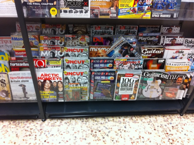
Was dragged to Tescos Extra in Watford last night (they've redecorated - I don't like it) and when checking out the magazine aisle I was actually very surprised to see how vast and diverse the music 'section' was.
The most noticeable things I noticed included the difference in Target audience which I believe can be divided into two major categories which anyone purchasing a music magazine will fall into - the listeners and the creators.
I imagine there is a huge difference between the content of Q, say, and Guitarist. This is because The latter is much more likely to focus on creating music than pointing people to songs/albums to listen to.
This has left me aware that my music magazine has a wide berth when it comes to the production.
Tuesday, 10 September 2013
Preliminary Task Planning
The Preliminary Task we were asked to do was to create a School Magazine. Here is a mock up of what my cover may look like.
I chose to make mine slightly tongue in cheek, because who doesn’t love a bit of Satire?
The main image was chosen due to the bright colours already provided; the yellow lends itself to a very simplistic colour scheme of
Primary colours, tying in with the school theme. I am likely to change the main image for the final cover as I believe it is too plain for the main story - then again, it is a school magazine.
The Two secondary articles were placed there due to being decent photos - The Portaloo and my friend Zak licking a column are both very striking images in their own way. I chose to give them their own hooks, presenting (what I believe would be) a very interesting story.
For my final Cover I am likely to put more features and articles. The Mockup was created in Powerpoint and I am looking forwards to starting to use the new software.
Subscribe to:
Posts (Atom)