Would a Rose by any other name smell as sweet?
Showing posts with label Research. Show all posts
Thursday, 17 October 2013
Tuesday, 15 October 2013
What's In a Name? Part One
There are four distinctive types of titles for music
magazines. These are:
Acronyms are defined as words formed from initial letters of words in a set phrase and these are popular when used with music magazines. One of the most recognisable is NME, which stands for New Musical Express. It is probable that the average reader does not consider what NME stands for, just that the brand identity has made it linked with music magazines.
If I were to choose an Acronym, the
letters would need to be catchy and flow. Most letters are monosyllabic but
some are easy to say than others. Zoolike Wonderful Beats would probably be
better off picking a better name than ZWB, if only to make it easier to say.
The Masthead for Q is an iconic, constant large letter Q in
white over a red background. This stands to function as the magazine’s logo and
features inside the magazine as well as predominantly on their website. This is
often the only constant thing on the magazine cover so it would have been
important to design it to be recognisable.
NME’s masthead opted to print what the initials stand for underneath the letters which are in blocky, red text. This gives the readers an understanding and context of what the magazine title means. I feel if I were to opt for an Acronym for a name I would also do this as opposed to Q’s seemingly random letter.
Interestingly, the Masthead for Top of The Pops has gone through many significant changes in the last ten years. This may be due to the niche and childlike target audience, not many children are likely to want to keep reading the magazine gone eight at the eldest. However, there are some consistencies. The bright colours make the magazine seem appealing and friendly, reassuring the reader and buyer (likely two different people considering the ages!) that this is child friendly.
Rolling Stone magazine generates many different connotations. My first thought was that it was a magazine focusing on specifically the band named the Rolling Stones although a glance at the cover reaffirms it has a much wider coverage. Stones link to the Rock aspect of the magazine, meaning the title shares aspects of connotative.
I personally really like the Rolling Stone masthead. Possibly due to the “Hot Rod” Red merging with the silver alludes to beautiful old fashioned cars of the seventies. I consider these cars significant iconography relating to rock and I feel this masthead is trying to recreate that, especially with the serifs on the end of the letters making it appear very retro, reminiscent of the traditional American diners. It’s a very effective and bold masthead, the red text ensuring it stands out.
Connotative titles are phrases or words that allude to the genre. They can even be onomatopoeic in the case of Kerrang! (exclamation mark included) which echoes the sound a guitar makes when strung. Other names include Vibe, Base, Edge and Spin. These are all one word names and often come packaged with their own punctuation.
Kerrang! features a harsh sound generated by the K, which is reminiscent of the genre of rock and this is echoed in the Masthead where the typeface chosen appears stressed with cracks starting to form within the white text. The text is either white or inverted occasionally to suit the cover. The exclamation Point emphasises the aggressiveness within the genre and highlights the values of Rock music.
- Acronym
- Phrase
- Connotative
- Compound
Acronyms are defined as words formed from initial letters of words in a set phrase and these are popular when used with music magazines. One of the most recognisable is NME, which stands for New Musical Express. It is probable that the average reader does not consider what NME stands for, just that the brand identity has made it linked with music magazines.
A different example is Q. This magazine was originally
titled “Cue”, a phrase to mean getting a record ready to play. They ran into
problems here as their connotative title as originally intended meant that it
could be easily mistaken for a Snooker magazine. This lead to their decision to
rename the magazine the onomatopoeic Q, which is another example of the brand
identity becoming more important than what the initials stand for.
NME’s masthead opted to print what the initials stand for underneath the letters which are in blocky, red text. This gives the readers an understanding and context of what the magazine title means. I feel if I were to opt for an Acronym for a name I would also do this as opposed to Q’s seemingly random letter.
Phrases are also
seen regularly. These include Top of The Pops, Smash Hits, Rolling Stone and
Drowned in Sound.
Top of the Pops immediately conveys the genre covered within
the magazine and the internal rhyme subtly alludes to the age the magazine is
intended for; it gives it an almost “childlike” feeling. Top is a superlative
of sorts and is conveying to the reader that it is only featuring the best
musicians. Interestingly, the Masthead for Top of The Pops has gone through many significant changes in the last ten years. This may be due to the niche and childlike target audience, not many children are likely to want to keep reading the magazine gone eight at the eldest. However, there are some consistencies. The bright colours make the magazine seem appealing and friendly, reassuring the reader and buyer (likely two different people considering the ages!) that this is child friendly.
Rolling Stone magazine generates many different connotations. My first thought was that it was a magazine focusing on specifically the band named the Rolling Stones although a glance at the cover reaffirms it has a much wider coverage. Stones link to the Rock aspect of the magazine, meaning the title shares aspects of connotative.
I personally really like the Rolling Stone masthead. Possibly due to the “Hot Rod” Red merging with the silver alludes to beautiful old fashioned cars of the seventies. I consider these cars significant iconography relating to rock and I feel this masthead is trying to recreate that, especially with the serifs on the end of the letters making it appear very retro, reminiscent of the traditional American diners. It’s a very effective and bold masthead, the red text ensuring it stands out.
Connotative titles are phrases or words that allude to the genre. They can even be onomatopoeic in the case of Kerrang! (exclamation mark included) which echoes the sound a guitar makes when strung. Other names include Vibe, Base, Edge and Spin. These are all one word names and often come packaged with their own punctuation.
Kerrang! features a harsh sound generated by the K, which is reminiscent of the genre of rock and this is echoed in the Masthead where the typeface chosen appears stressed with cracks starting to form within the white text. The text is either white or inverted occasionally to suit the cover. The exclamation Point emphasises the aggressiveness within the genre and highlights the values of Rock music.
Wednesday, 9 October 2013
Tuesday, 8 October 2013
Monday, 7 October 2013
Monday, 30 September 2013
Thursday, 26 September 2013
Survey
Please Check out my Survey!
My survey was designed to examine the views and opinions of potential readers. I have attempted to make as many questions as possible "Multiple Choice" to make it easier for the people filling it out. I have focused my questions on ones that will allow me to understand what readers and buyers are looking for - especially in respect to the digital aspect of it. My survey has directly impacted my decision to make the coverstars of the magazine established artists as that is what my audience wants.
Tuesday, 24 September 2013
Monday, 16 September 2013
Magazine Cover Analysis
I've been assigned the task of analysing three magazine covers. After seeing the wide variation in Tesco over the weekend, I opted to choose three very different music magazines.
1. Q
1. Q
Q is a monthly music magazine covering the Indie Rock genre of music. The consistent house style is the red Q in the top left corner. This edition features the lovely Florence (minus the machine) as a cover star. What is worth noting is that the creators of Q have opted out of overly sexualising her in the image which can be the norm with females on the covers of magazines. The image instead focuses on attracting people with the vibrant colours of Florence's hair and makeup contrasting with her pale skin. This appeals to their demographic of music listeners who are far more likely to appreciate music on its own merits, not relating to the attractiveness of the artist.
The hooklines link to articles within the magazine and promise features that will appeal to their readership - the 16-Page Gig Guide would have likely been published during festival season, when the readers are likely to go to see their favourite bands for the first time. The pull line for Skrillex raises a debate many readers feel passionate about one way or another and are likely to want to read the view of writers, who's opinion they respect.
2. Kerrang!
Kerrang covers a different genre to Q and therefore appeals to a different demographic. This time, teens or young adults who like rock. These readers will appreciate the promise of posters inside as they are more likely to place them on their wall than readers of other magazines.
The band's facial expressions seem very aggressive and chaotic (except for the guy on the right, who doesn't look like he's even trying) which would appeal to their target audience of individualists who want to rebel against the "system" and listening to a different genre of music not considered pop. The bright colours make the magazine stand out amongst the others and give it a distinctive style.
3. Guitarist
This is a very obviously different style of music magazine, intended for the creators instead of the consumers. There are no singers or bands on this cover, instead a very striking blue electric guitar. This magazine will, I imagine, appeal to the must niche market out of the ones I have chosen to analyse. It is only those with a prior knowledge of guitar playing who will consider buying this. The interviews it offers aren't well known people yet I imagine due to their prominence appearing on the cover they will be recognisable to the community. The promise of 51 pages of product reviews highlights the main content of the magazine and shows the reader what they can expect.
Saturday, 14 September 2013
Every little helps...
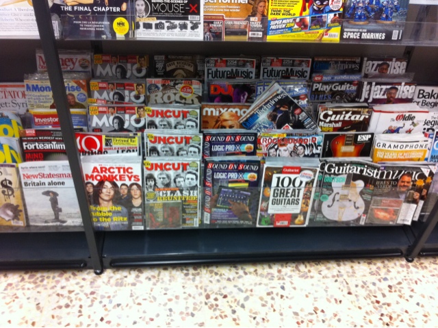
Was dragged to Tescos Extra in Watford last night (they've redecorated - I don't like it) and when checking out the magazine aisle I was actually very surprised to see how vast and diverse the music 'section' was.
The most noticeable things I noticed included the difference in Target audience which I believe can be divided into two major categories which anyone purchasing a music magazine will fall into - the listeners and the creators.
I imagine there is a huge difference between the content of Q, say, and Guitarist. This is because The latter is much more likely to focus on creating music than pointing people to songs/albums to listen to.
This has left me aware that my music magazine has a wide berth when it comes to the production.
Subscribe to:
Posts (Atom)